Understanding How Colors Influence Consumer Behavior
Color has a significant effect on the brand image that we can have. It often becomes the first thing that people tend to notice and can manage to create the particular feelings and judgments in them, indeed, without reading the advertisement itself.
The so-called color psychology in branding is what distinguishes this concept as a very strategic tool. It is used primarily by marketers and designers to work on the strong connections between brands and their target audiences.
As a matter of fact, research proves that nearly 90% of the consumers’ initial product assessments may be entirely based on color, provided it is a talking product.
It should also be mentioned that a particular study, one carried out by Reboot Online, shows that there is an upsurge of brand recognition equal to 80% if the companies keep the right color consistently throughout the marketing channels.
Color not only attracts but also conveys trust, energy, luxury, or simplicity in the blink of an eye. Whether you are a newcomer or revamping your brand, colors are a determining point because they either create or destroy the customers’ first impression.
In this blog, we’ll explore how colors impact branding, why certain colors are chosen over others, and how you can apply color psychology to your brand effectively.
What Is Color Psychology?
Color psychology is the study of how colors affect human behavior and feelings. It reveals why certain colors trigger certain emotions, like for example calm, joy, or confidence.
Profiteers and decorators exploit this idea to affect the perceptions and choices of consumers. It is very important in advertising, branding, and user experience design.
Investigation presents the fact that people unconsciously judge a product during the first 90 seconds of exposure, and about 90% of this evaluation is influenced by the color of that product.
In consequence, color psychology becomes a very effective instrument for the establishment of emotional ties and customer engagement reinforcement.
By knowing what varieties of colors influence the human brain, corporations can increase the efficiency of communication and strengthen the impression of their brand.
What Is Color Psychology in Branding?
In branding, color psychology refers to the strategic use of colors to shape consumer perception of a brand. Different colors are carefully chosen to reflect brand values, tone, and personality.
For instance, blue often conveys trust and professionalism, making it a popular choice in the financial and tech sectors. 57% of consumers are more likely to purchase from a brand that uses color effectively.
The choice of color can also influence customer behavior. Research shows that 85% of consumers make purchasing decisions based on color alone. Companies use color psychology to build strong emotional.
Color decisions in branding play a pivotal role in shaping how a business is viewed, and understanding their psychological impact is essential for creating a powerful, consistent brand image.
Why Color Psychology Matters in Branding

Color can influence up to 90% of a consumer’s initial judgment of a product or brand. The right color choices help create strong emotional connections with the audience.
They improve brand recognition, communicate messages, and even drive purchasing decisions. According to a study by the Institute for Color Research, people make a subconscious judgment about a product within 90 seconds of initial viewing—and 62% to 90% of that assessment is based on color alone.
Furthermore, research from the University of Loyola found that color increases brand recognition by up to 80%.
The psychological impact of colors can directly influence customer loyalty and perceptions, which is why choosing the right colors is crucial for establishing a strong and lasting brand identity.
Additionally, a study conducted by the Seoul International Color Expo showed that 85% of consumers make a purchase decision based on color alone.
This further underscores the importance of selecting brand colors carefully to align with the target audience’s emotional triggers.
How Color Psychology Impacts Your Brand
One of the ways you can influence customer behavior, trust, and recognition with your brand is through the colors you choose.
As an illustration, red is an emotion of urgency and excitement. That is why it is often used in clearance sales or fast-food marketing to drive quick decisions.
On the contrary, blue signifies reliability and professionalism, which many banks, tech companies, and healthcare brands have as their number one choice.
Through careful color selection, you not only deliver a consistent brand image but also one that provides a positive experience, leading to better brand recall, thus making your brand ultimately memorable.
According to Forbes, displaying your brand uniformly, with the help of the right colors, can lead to an increase in revenue of up to 23%.
It’s interesting that color, as the research conducted by CCICOLOR has shown, influences the purchasing decisions of 85% of the consumers.
This only emphasizes the role colors play in shaping consumer buying behavior as well as success in the business field.
When the core of your brand and the colors you use are in correlation to your values and the people you are across the business, you will be able to create a stronger emotional connection and greater brand loyalty.
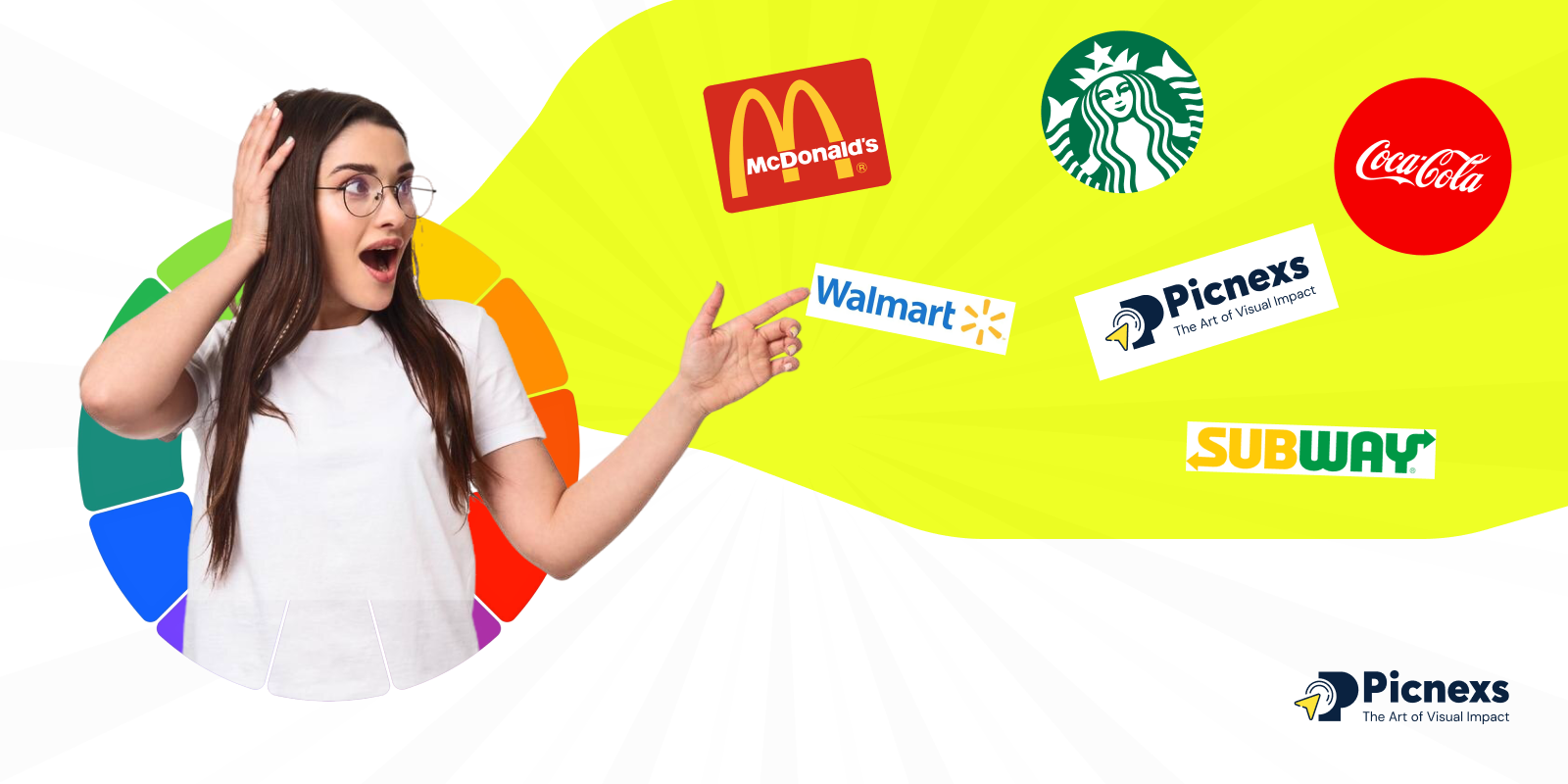
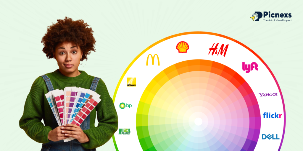
Real-World Examples of Color Psychology in Branding
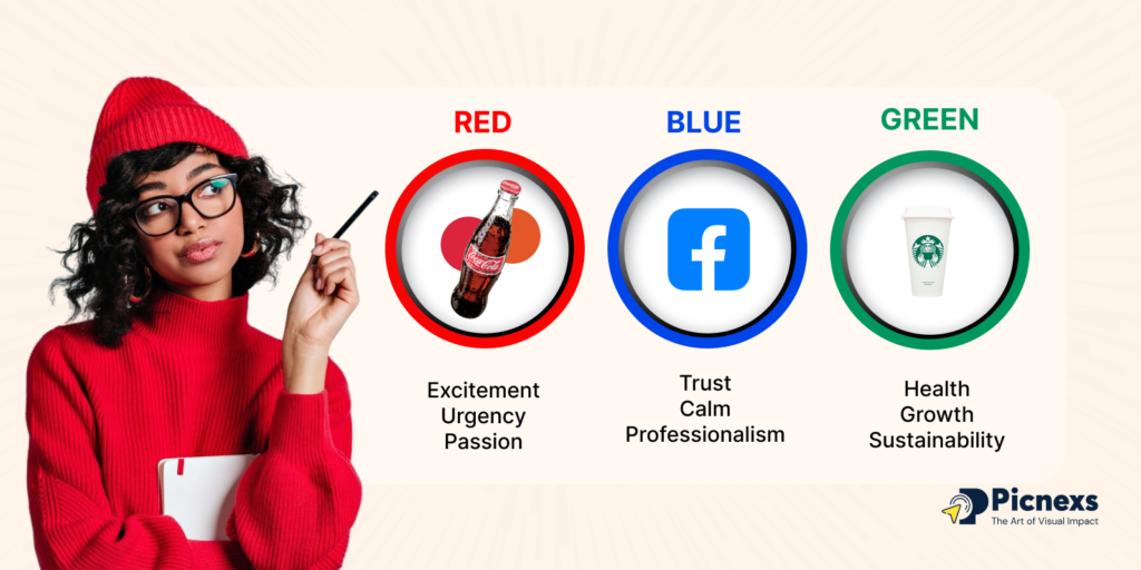
Coca-Cola chooses red to indicate that the product is, in fact, full of excitement and passion, which strongly enhances the image of the brand as a daring and energetic one.
Facebook selects blue as the color for users to feel that they can trust it, be dependable, and a safe place to stay. Starbucks comes up with the color green to show the nature and fresh connection, and uses it, and also with nature.
These well-known brands are meticulously selecting the colors to evoke an emotional feeling and enrich brand recognition. According to the survey conducted by Reboot, using a unique color can improve brand recognition up to 80%.
Color Psychology Chart
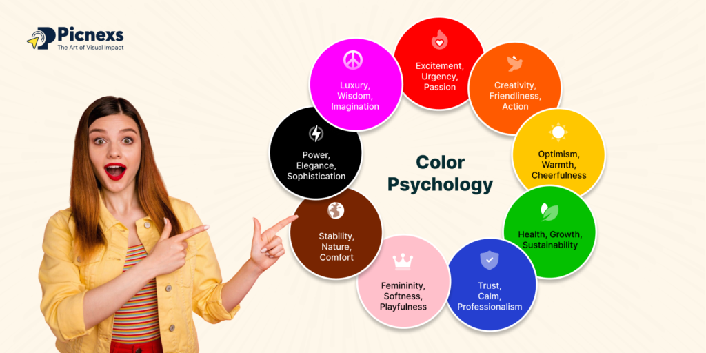
| Color | Emotion & Meaning | Brand Examples |
| Red | Excitement, urgency, passion | Coca-Cola, YouTube |
| Blue | Trust, calm, professionalism | Facebook, IBM |
| Yellow | Optimism, warmth, cheerfulness | McDonald’s, Snapchat |
| Green | Health, growth, sustainability | Starbucks, Whole Foods |
| Orange | Creativity, friendliness, action | Fanta, SoundCloud |
| Purple | Luxury, wisdom, imagination | Cadbury, Hallmark |
| Black | Power, elegance, sophistication | Nike, Chanel |
| White | Simplicity, clarity, purity | Apple, Adidas |
| Pink | Femininity, softness, playfulness | Barbie, T-Mobile |
| Brown | Stability, nature, comfort | UPS, M&M’s |
| Gray | Balance, neutrality, professionalism | Apple, Mercedes-Benz |
| Gold | Wealth, luxury, prestige | Rolex, Versace |
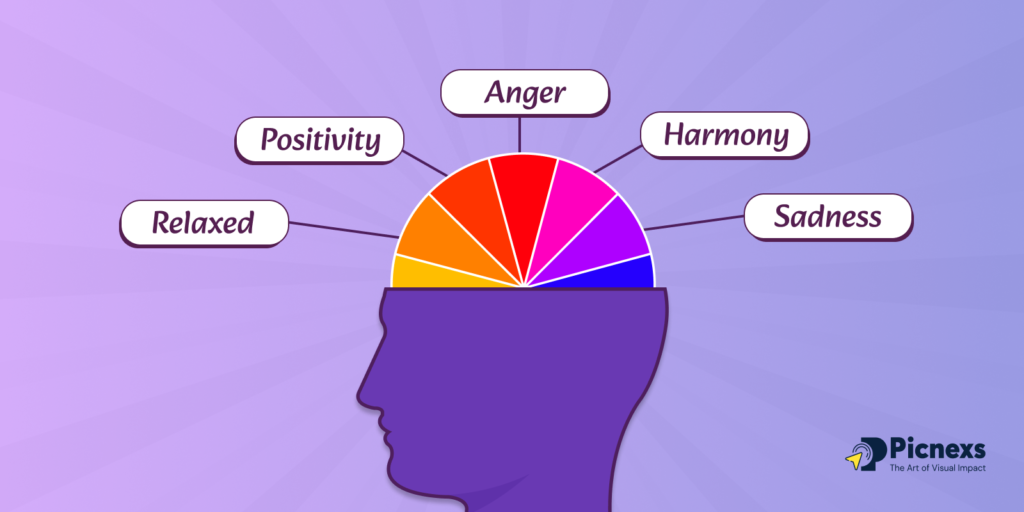
The Psychology of 12 Popular Colors
Red:
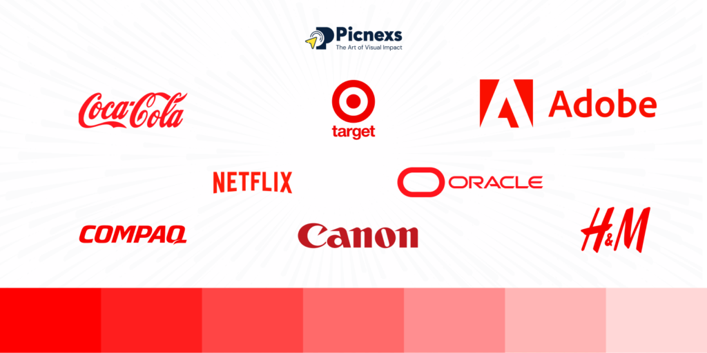
The mention of red in colors corresponds to excitement, energy, and urgency. This color is often used to capture the attention and stimulate quick decisions.
Brands such as Coca-Cola and Netflix use red to create sexual passion and also develop a feeling of the importance of a product.
It is highly recommended for brands that seek to come off as daring and energetic (bold and active).
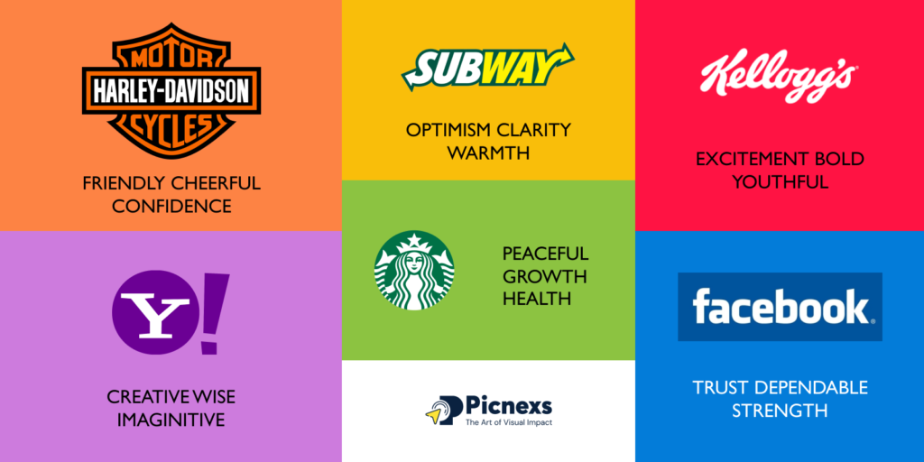
Blue:
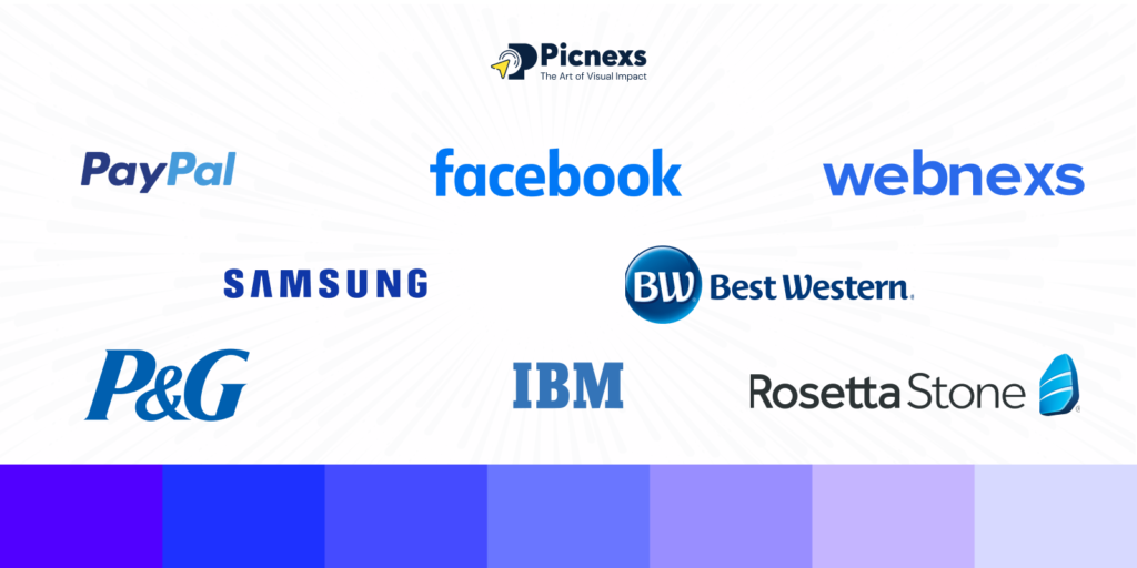
Blue represents dependability, peacefulness, and professionalism. It is a color that provides a feeling of trustworthiness and security, and, usually, it is the preferred color of the tech and finance industry.
Companies like Facebook and PayPal opt for the color because it brings about a sense of capability and creates a strong impression of truth as well.
It is very good for brands whose goal is to be seen as constant and trustworthy.
Yellow:
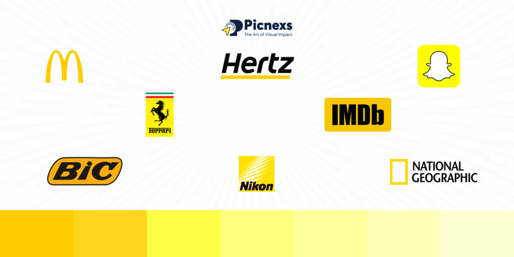
This color is the one that is closely associated with happiness, optimism, and warmth.
It has the ability to draw attention and arouse a positive feeling. The presence of a yellow color in the logo, for example, in McDonald’s and Snapchat, helps create a very friendly and high-spirited image.
Brands aiming their product at a younger or family audience would benefit the most from using yellow as their main color.
Green:

Green symbolizes health, growth, and nature. It is typical for earth-friendly and health-related items.
Whole Foods and Starbucks, for example, employ green to symbolize sustainability and freshness.
It also goes well with brands that are in the health, food, or environmental sectors.
Orange:

Orange indicates friendliness, enthusiasm, and creativity. It motivates people to move without the intensity of red.
Brands such as Fanta and SoundCloud use orange to spread excitement and positivity. It is best suited for brands with the purpose of being fresh and captivating.
Purple:

Purple has a connection to luxury, wisdom, and imagination. It is an indicator of the history related to goodwill and wisdom.
Purple gets the best out of brands like Cadbury and Hallmark to suggest they are current and innovative.
It is also good for brands that want to showcase elegance or uniqueness.
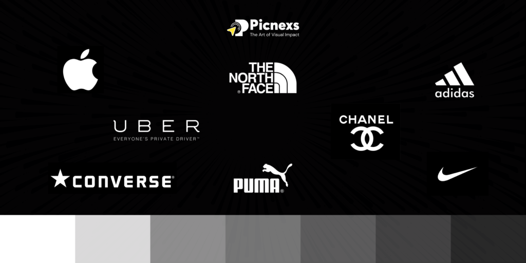
Black:
Black gives us a view of power, elegance, and formality. Its presence creates an atmosphere of exclusivity and luxury attraction.
This color provides a sleek and elite look for brands such as Nike and Chanel. It is also a good fit for luxury and fashion brands.
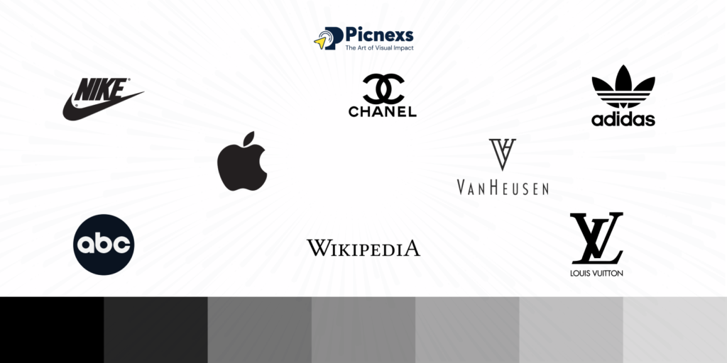
White:
White is considered the symbol of purity, simplicity, and cleanliness. It helps to achieve minimalism and gives a modern feeling.
For example, firms like Apple and Adidas use white to show that they are the companies that are most innovative and have the most clarity about their products. It is perfect for tech and health-related brands.
Pink:
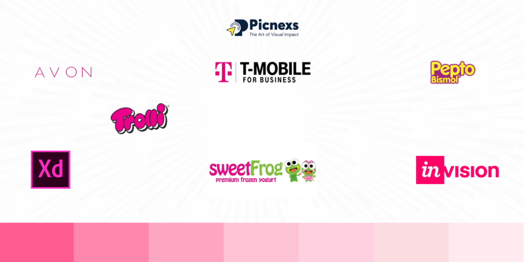
Pink color is used to demonstrate feminine, sweet, and nice characteristics. Usually, it is the color of choice for the younger audience or those who want to show delicacy and loveliness.
Brands like Barbie and T-Mobile employ pink to project a company of warmth and friendliness. It is a win-win option for lifestyle and beauty brands.
Brown:

Brown is associated with qualities like durability, trustworthiness, and a down-to-earth aspect.
It makes the recipient feel safe, trustworthy, and close to nature. Brands such as UPS and M&M’s deploy brown to show customers the essence of being comforting and traditional brown also perfectly fits organic and rustic types of businesses.
Gray:
Gray denotes neutrality, equal distribution, and professionalism. So it usually is a bit cool and refined in tone.
Brands like Mercedes-Benz and Apple use gray to signify the essence of being modern. It’s usually the best in corporate and tech branding.
Gold:
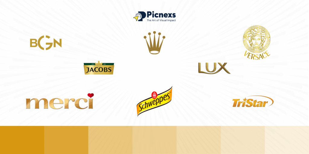
Gold is the color that represents prestige, wealth, and prosperity. It creates an idea of being magnificent and can make a situation look grand.
Brands like Rolex and Versace use gold to communicate the exclusivity of their brands. It is the best color to use if you cater to the high class.
5 Tips for Picking Your Brand Colors

- Know Your Target Audience: People from different age groups, genders, and cultures have different colors they perceive. Choose the colors that connect with this specific segment of your audience emotionally.
- Understand Your Brand Personality: Clarify the traits of your brand, whether it is fun, trustworthy, professional, or bold. Your colors must be representative of these characters consistently across all materials.
- Study the Competition: Find out the colors your competitors are using and decide how you can be different. It’s not necessary to be a clone of them, but the industry standards still need to be followed.
- Build a Balanced Color Palette: Start with a major color of your choice and add secondary and accent hues to that. This will not only give your brand the space to grow but also ensure visual harmony in your branding.
- Test and Get Feedback: Before sealing the deal, present your color picks to your audience for testing. With feedback, make sure that your colors provoke the correct emotions and are still in line with your message.
Conclusion:
Colors are not only visible elements but also profound stimuli that can affect how customers think of your brand.
The proper color selection can be responsible for a long list of effects, from nurturing trust to causing the spark of joy in people’s hearts, which ones that boost the brand image, recognition, and customer purchasing behavior.
By getting aware of color psychology, you can convey the message and strengthen the brand influence you have in your niche market and among consumers.
If you are wondering about crafting a brand that matches your key audience, then go to Picnexs and take a tour through the platform that will facilitate your creative process, offering not only a unique but also an emotional brand.
Let your brand be a personal picnexs.com has an excellent platform you can use today!

Leave a Reply