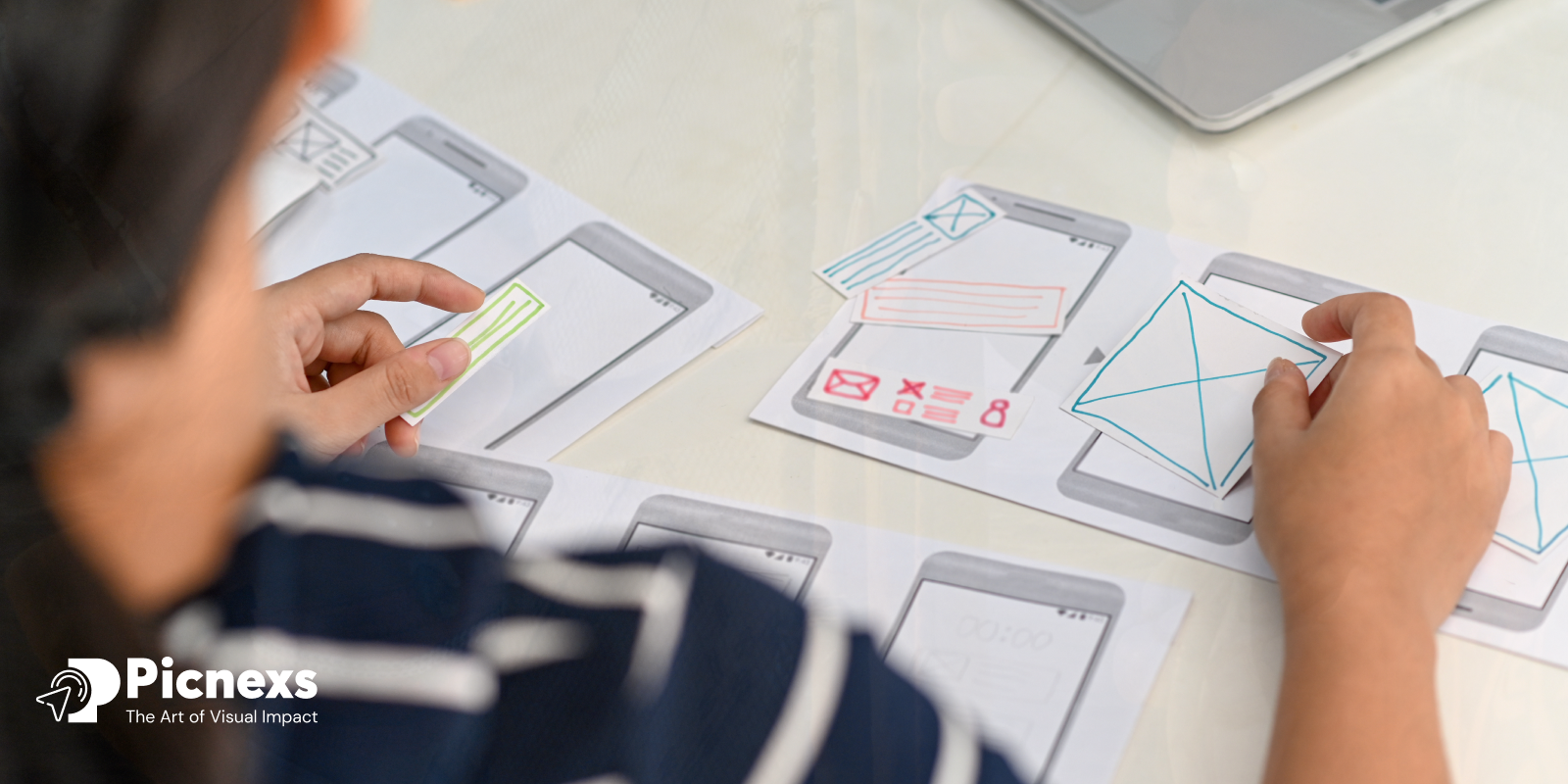
Interaction is the key to human life, it’s essential in the digital world to build relationships and to have interactive user-interfaces. It’s more than just basic functionality that user interfaces need to offer—they need to engage users, especially at a time when we are spending more time on our devices.
Visions and sounds are the main driving force but micro-interactions are the secret ingredient that takes User Experience (UX) to a whole new level. These small, yet impactful details provide feedback, enhance usability, and create a more intuitive, delightful experience that keeps users engaged and coming back for more micro-interactions.
- 70% of users of a website or app give the ease of use feature such value that they do not easily leave.
- 94% of the first impressions are design-related. That means micro-interactions are an important part of the usability and visual appeal.
- Micro-interactions are one of the ways to influence the engagement by up to 30%, which is a fundamental part of customer retention.
What is micro-interaction

A micro-interaction refers to the small, almost invisible actions which go on within the product upon the action of the user. They provide feedback to the user at different times, such as at the end of a certain activity, giving them the directions to go, or motivating them to continue doing these games, which leads to their enjoyment. Micro-interactions are intended to be simple and efficient and provide visual interactions and sounds and/or touch ones that deliver feedback to the user on the types of manipulation the user performs.
Examples of micro-interactions include:
- A button changing color when hovered over.
- A notification appears when a new message is received.
- A smooth animation when liking a post or completing a task.
Despite their minuteness, micro-interactions are a way of enhancing the usability of an interface, providing users with instant feedback, hence boosting up the human feel of a digital interface. They are so integral that the mechanism of the product and the response times are perceived as instantaneous thus fooling the user into believing that this is what they have thought of the machine.
14 successful micro-interactions that enhance UX/UI design:
1. Pull-to-Refresh Animation
Example: Twitter
How it Works: Get the users to pull down the screen to promote fresh content in an app. While doing that, you can use spinner or elastic animations that indicate that the app is getting new updates. The release of the pull initiates the refresh.
Impact: The movement comes from the user and it is very similar to him/her moving a physical object. A sense of control is provided by a visual confirmation of the app, which reduces frustration for the users.
2. Animated Like Button
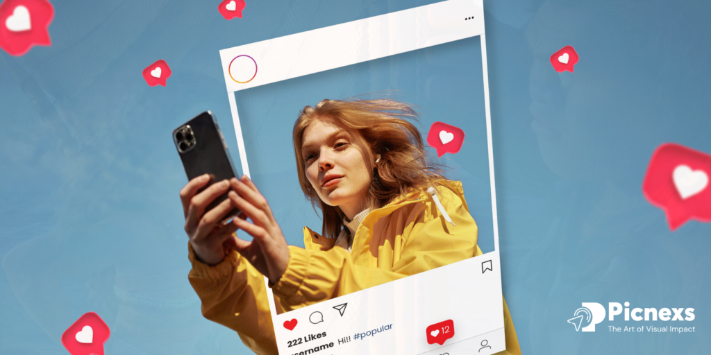
Example: Instagram
How it Works: By pressing the like button or double-tapping on a post, a heart animation is activated. With a double-tap, a large heart instantly appears over the post and then fades away, while the button changes its color to indicate the action.
Impact: This effect of the interaction allows the user to connect emotionally to a simple task, hence the experience of expressing appreciation becomes more enjoyable and memorable.
3. Typing Indicator
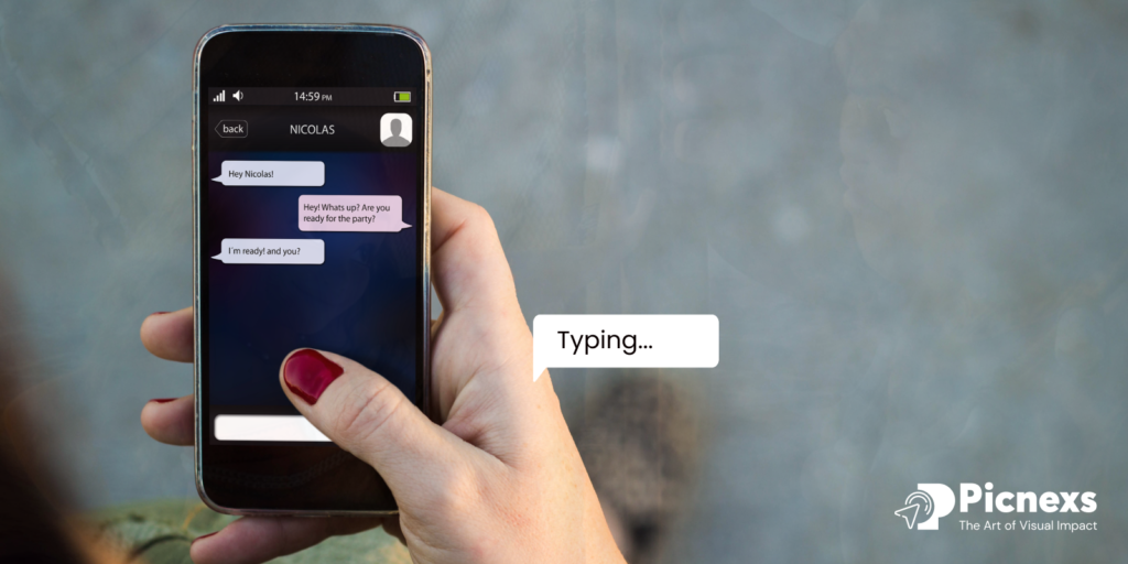
Example: WhatsApp
How it Works: When a user is typing a message to a chat, a live ellipsis (three dots) appears for the recipient. The dots move back and forth, which indicates that someone is typing in progress.
Impact: It shows that a person is still typing, thus, removes any concerns about whether you are going to be ignored. And this makes the users entertained while waiting for the message.
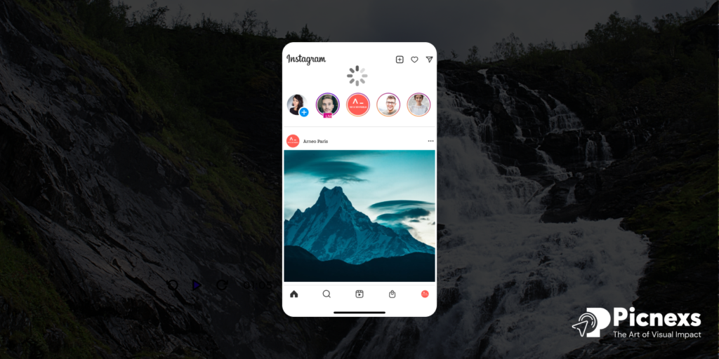
4. Progress Indicator
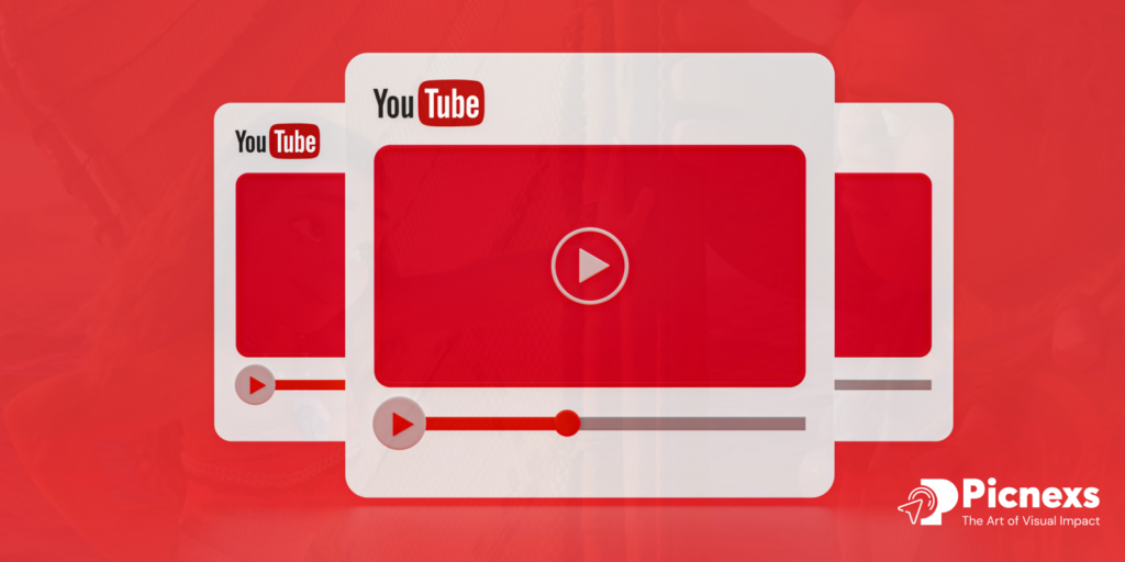
Example: YouTube
How it Works: A small bar on the top of the screen turns red and then starts sliding during the video or page loading. The speed of the movement is adjusted accordingly, so it reflects the progress in real-time.
Impact: It is like an indication to the users that the system is initializing and the wait time will be expected, that things are either loading or have been the cause of frustration in the past.
5. Toggle Switch Animation
Example: iOS Settings
How it Works: By tapping on the toggle, the element is smoothly shifted from one end to the other with a change of color, for example, turning to green when the switch is turned on and grey when the switch is turned off. The movement is augmented by the use of slight shadows over the elements and transitions between them.
Impact: This is a simple and a very clear way to keep track of the toggle. Users will be able to tell that the manipulation has been successful because of the visual feedback.
6. Password Strength Checker

Example: LinkedIn
How it Works: When a user types a password, a loading bar represents the progress that fills the container smoothly and changes color according to password’s criterions like length, uppercase letters, and symbols (e.g., red for weak, green for strong).
Impact: Feedback on the quality of the password instantly reaches the user, thus not only making people safe but also encouraging them to form new habits of protecting their accounts. It also prevents misjudgment and annoyance by precisely reflecting the expected behavior.
7. Hover Effects
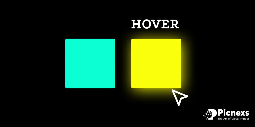
Example: Netflix
How it Works: When a user hovers over a movie or show thumbnail, the image zooms in and the title, brief description, or play button will be displayed this way. The change is so smooth and quick.
Impact: By doing so, the user will be invited to explore more content without overloading the interface. It defines the feeling of discovery and interaction.
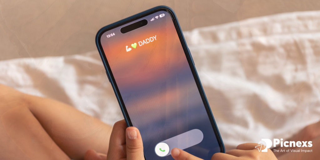
8. Error Shake Animation
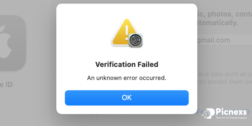
Example: Apple ID Login
How it Works: If a user enters wrong login credentials, the input box will move slightly back and forth, which looks like a gesture of the shaking of the head. It will be accompanied by a sound or a visible alert.
Impact: The jerk performs its work of immediate focus on the trouble of what it should be without any additional mess. It’s straightforward as the users immediately associate the shaking with rejection or an error message.
9. Notification Badge
Example: Facebook
How it Works: A red badge emerges on app icons and within the app to indicate that a new activity takes place such as messages, friend requests, or notifications. Very often the badge also contains a number indicating the count of updates.
Impact: The lively and bold red color will vividly attract the user’s attention and make him think about the need to check the notification. It acts as an engagement-stimulant by the users’ curiosity.
10. Pinch-to-Zoom Gesture

Example: Google Photos
How it Works: The way users do this is by touching the device screen with two fingers and then moving them apart or together to magnify or diminish the image. The zoom is smooth and responsive, with sharp resolution adjustments as the zoom level changes. Clear all the way.
Impact: This easy-to-use gesture lets users concentrate on specific text without any problems. Practicing real-world behavior design, this approach becomes the source of naturalistic interaction.
11. Task Completion Celebration

Example: Trello
How it Works: When you complete a task, the platform triggers small celebrations like confetti or encouraging messages, creating a sense of achievement and motivating consistent task completion.
Impact: You’ll feel the urge to undertake and actually finish tasks through use of such visual prompts. These are unspectacular actions that will turn into special moments of gratification.
12. Swipe-to-Delete
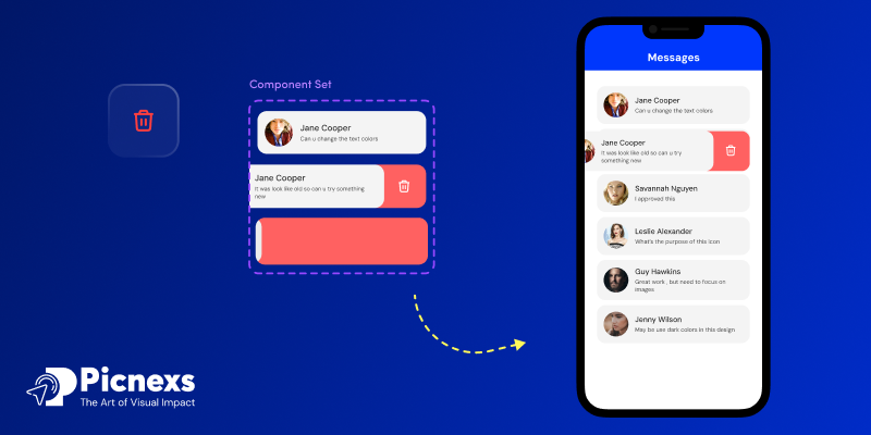
Example: Apple Mail
How it Works: Dragging an email towards the left side of the screen will cause the email to pop up with such options as delete and archive. If the user keeps swiping, the email will vanish with a fading animation.
Impact: This not only reduces the number of taps when performing the most common actions therefore making it more efficient, but the specialty feature makes the users feel like they are masters of their own destinies.
13. Auto-Save Confirmation
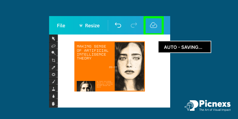
Example: Google Docs
How it Works: Each modification is followed by a momentary appearance of the result message “All changes saved to Drive” at the top of the document. It is an immediate process that is automatic.
Impact: This feature offers a feeling of certainty that their job is being done continuously, it thereby helps them to forget about the fear of the loss of stored data and the manual process of always saving.
14. Real-Time Search Suggestions

Example: Google Search
How it Works: Searching on Google by typing the search bar, Google now provides instant suggestions underneath. The keyboard’s accompanying suggestions averages out the number of recommended queries after each keystone, thrilling users to work with smooth application at all times.
Impact: It enables quick searching thus lessening the effort to get the necessary information. The feature further enhances the correctness of the questions by giving the right answers directly.
Challenges in Implementing Micro-Interactions

Overusing Animations: Too many animations can overwhelm users by producing potential distractions or bring about frustration or steering them away from the primary content.
Achieving Consistency Across Platforms: Overcoming the challenges of creating the same micro-interactions on different devices and screens is a struggle.
Performance Problems: The use of heavy animations or micro-interactions that are not optimized well can result in slow performance which is enough to ruin the experience of the user.
Design Complexities: Creating micro-interactions that are both efficient and beautifully designed is a challenging and time-consuming task.
User Disappointment Management: The aspect that some users may not be aware of or do not expect during micro-interactions can lead to ineffable confusion and a wrong reading.
Solutions to Overcome These Challenges

Simplify and Prioritize Animations: Avoid being too elaborate with micro-interactions and instead focus on main actions like filling out forms or completing tasks, making sure they improve the experience without overwhelming the users.
Ensure Cross-Platform Consistency: Develop micro-interactions that are adaptive to different screen sizes and devices, yet maintain the same user experience.
Optimize for Performance: Animation should be strictly optimized for speed by coding the norms and running tests that can verify that none of the app or site functionalities are affected by the animations.
Streamline the Design Process: Undertake joint exercises with designers and developers to design one-to-many interactions. Make sure to apply a design system and UI kit in your work to ensure that the appearance and functionality are kept constant.
Manage User Expectations: Define the purpose of each micro-interaction clearly and use common patterns. Provide some guidance or tutorials if necessary, especially for the new or hard interactions.
Conclusion
Micro-interactions are critical in creating user experiences that are engaging and simple to pick up. They not only make the product more responsive, they also make it more usable and provide valuable feedback. To achieve employment of pointier designs, multi-platform synchronization, and proper performance, challenges such as overuse, consistency, and performance related ones can be solved. When joyful thoughts are put into practice, micro-interactions serve as strong elements to encourage user engagement amongst other activities, thus making them an effective tool for 2025 and beyond.

Leave a Reply